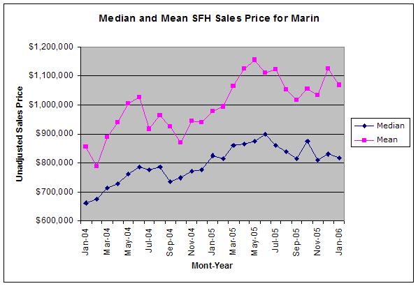
The first chart shows median and mean sales prices for all months between January, 2004 and January, 2006, inclusive:
 (Click on the image for a larger view.)
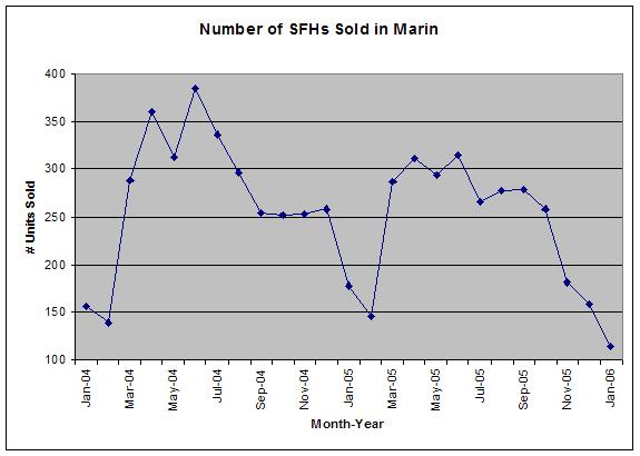
The next chart shows the number sold for all months between January, 2004 and January, 2006, inclusive:
 (Click on the image for a larger view.)
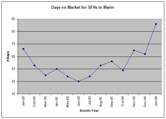
The next chart shows the average number of days on the market before being sold for the months between January, 2005 and January, 2006, inclusive:
 (Click on the image for a larger view.)
The next chart shows the year-over-year percent change in the median sales price between January, 2005 and January, 2006, inclusive:
 (Click on the image for a larger view.)
The next chart shows the year-over-year percent change in the number of sales for the months between January, 2004 and January, 2006, inclusive:
 (Click on the image for a larger view.)
Enjoy.
I found this quote, found here, to be potentially prophetic for Marin:
“The problem in areas like Boston and Silicon Valley is that home prices shot up so high, even declining prices aren’t attractive especially as interest rates rise.”
4 comments:
I like the first chart because the median data seems to show the peak of the housing bubble in Marin occurring in June, 2005 which fits in well with what other housing bubble observers note for other markets.
Good charts. Suggestion; my new favorite indicator is adsorption rate. Monthly sales divided by new listings
Good work. Do you have any longer term graphs? I'd be interesting to see Marins pricing in the 80's, & 90's to compare and see what happend then.
Please visit the Marin Real Estate Data blog over on the right hand margin and see if what you are looking for is already there. Thanks.
Post a Comment