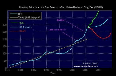
I've posted this person's housing data before, but he now has a new site and so I thought I'd bring it to your attention. I will also link to it over in the right margin. It can be found
here. The data that includes Marin County can be found
here. Enjoy!
And here is a hacked version of his data showing various predictions.
According to
this (thanks to the reader who sent it in), panic may have already started in some corners of the world-wide property bubble. What will be, will be...

7 comments:
Yes, my MS Paint skills reign supreme!
This graph reminds me of a similar graph -- that of the Nasdaq's long term trend up to about 1999....and we all know what happened there......
If your trend line is defined as constant percentage year-over-year increase, shouldn't it be curving upward, rather than a straight line?
Of course the trend line should be compunded. i've been tryin to tell people using these data that same thing for months. They aren't going to change because it reduces the bubble excess by roughly 40% so it doesn't look as scary.
Perhaps people should learn that an index is a log based graph so a constant percentage growth rate isn't graphed as an upward curve but rather as a straight line...
Log Y is the easiest certainly.
When I did the graph for my area Oxnard-Thousand Oaks- Ventura, CA I used simple compounding:
Y1 = Y0 times 1 to power (1 + percent trend)
I then normalized to 1995 = 100.
Moving averages won't give a baseline and will massively lag then overshoot in a bubble.
If the trend is constant 6% year-over-year increase:
y(current year)
= y(last year) * 1.06
= y(1995) * 1.06 ^ (current year - 1995)
If you want to do it quarterly, find the quaterly growth rate by taking 1.06^(1/4):
1.06^(1/4) = 1.01467
y(current quarter)
= y(base quarter) * 1.01467 ^ (number of quarters elapsed)
Post a Comment