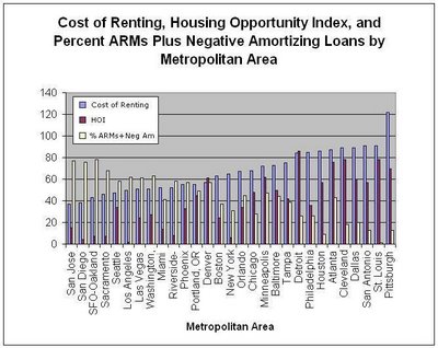
The graph shows for various metropolitan areas:
- Cost of renting (smaller numbers mean renting is more affordable vs. owning).
- Housing opportunity index (affordability, smaller numbers mean less affordable).
- Total percentage of loans that are ARM or negative amortizing.
Enjoy.

Update: According to this article, if ARMs, Neg Ams, etc. are removed or curtailed, then the result for the housing market would be to "precipitate a disaster of epic proportions". Looking at the above graph, the Bay Area (including Marin) is far from immune to such a disaster.
3 comments:
It would be interesting to take that data, group it into West and North East, and then plot them against each other. I leave it to you or someone else to do that.
If a logarithmic chart is used the 2010 value is about $210,000.
And if the inflation numbers are understated, prices are not as overvalued as the numbers suggest.
I think that the prices will be flat to down 3-4% for the next 3-4 years, and that rents will increase 4-6% until home prics are about 10-12 times annual rent nationally and 13-15 times annual rent in Marin. his is what happened after previous price runups.
"logarithmic charts"--what is that going to tell us that we don't already know?
Personally, I've lost count how many HPI charts and overvaluation indices I've read suggesting the level of overvaluation locally. Then, I've actually compared individual home values over the 1998-2006 period against long-term historical trends. I've found my results to corroborate between datasets, which hasn't made me too bullish that high BA RE prices are here to stay. Then again, more good data isn't a bad thing. If people have a good argument to present, they should get to specifics.
Post a Comment